Meet Here
Summary
Meet Here is a location based app that serves to help the user find places of interest that are in the middle of them and up to 3 friends’ locations. The goal of Meet Here is not only to give users new places to enjoy but also to provide those new places with more business.
Roles & Responsibilities
Platforms: Mobile App
My responsibilities included user research, concept ideation, designing user flows, visual design, prototyping, user testing, and incorporating user feedback into design iterations.
Problem
As a user I want to be able to find a place of interest that are in close proximity of me and my friends' locations.
As a user, I want to be able to use price filters so that I can choose how much I'd be spending at the place of interest of my choice.
As a user I want to be able to save the places of interest that I find in the app.
As a user I want to be able to see in app google reviews of the places of interest that I choose.
As a user once I find a place of interest, I want to be able to tap for directions and be taken to my favorite navigation app.
These were the five MVP requirements.
Meet Here was inspired by a real life situation. There was a day where myself and two friends were in three different locations. Only one problem presented itself, where could we meet in the middle? I ended making a crude map of each of our locations but I thought there should be an app for people to meet in the middle and be provided with various places of interest. I designed Meet Here as an app that would both bring people together and bring attention to places that may not have been noticed otherwise.
Audience
Meet Here was designed for people who seek to experience new and convenient place with friends or family. The audience also includes people with disposable income and ability to enjoy new and various places.
Research
To be able to acquire the information needed, I created an online survey. I was able to gather insight from people who both wanted to explore new places of interest and had friends/family they wanted to do it with.
Research Findings
Users indicated how often they sought out new places of interest.
Users indicated their favorite features of the current app they use to find places of interest.
Users indicated what type of feature they would like to see on “Meet Here”
Q. What app/website do you currently use to find places of interest?
Roadside America
Instagram
Google Maps
Reddit
Trip Advisor
Q. What is something you do not like about the current app/website you use to find new places of interest?
No price filter
No specified rating system
Cant save places
No suggestions
Complicated to use
Competitive Analysis
This was the only app I found that does what Meet Here does. It was difficult to even get in.
Reddit is a plethora of information however the user would have to search what they are looking for without seeing proximity factors.
User Flows
Flow 1 - Find a place of interest that is in the middle of the user and others’ locations
Flow 2 - Use price filters
Flow 3 -Save the places of interest that I find in the app.
Flow 4 - See in app google reviews of the places of interest that I choose.
Flow 5 - As a user once I find a place of interest, I want to be able to tap for directions and be taken to my favorite navigation app.
Sketches
User Personas
Digital Wireframes
Brand Development
Logo
I wanted users to see the location icon and understand that Meet Here is a location based app. I also wanted the map to be included so that users could gather the context that Meet Here will give you an exact location they can tell their people to “Meet here.”
Color Palette
Theses colors were a challenge to find. I wanted to use red, to depict adventure. Also because it is obviously well known for standing out. The blue is really more for icons.
Typeface
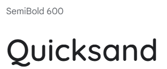
I did some research about fonts before choosing these. I ended up learning that these two fonts are often paired together and are used to portray a modern look, which is what I was going for.
Usability Testing
There were 6 tasks designed for users to help test the app.
Enter user’s and three others’ locations and find results
Find price filters for places of interest
Add a restaurant to favorites
Find in-app Google reviews of a place of interest.
Find navigation button to your desired navigation app.
Adjust location area settings.
The age ranges for these usability tests were from 18-35. THe tests were done in-person using the Steve Krug testing script.
All participants understood the general premise of Meet Here
1 of the 3 participants had difficulty using the navigation button for restaurant directions.
The “adjust location area” settings received constant praise from all participants.
I found the user participants by word of mouth and through friends who I knew took the bus consistently.
Channels Used:
Personal Network
Screening Criteria:
Be interested in experiencing places of interest
Be interested in an app that would show places in proximity of themselves and others.
Have disposable income enough to warrant going out with others somewhat often.
Results
Prototyping
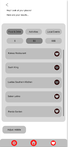
This was the first version of Meet Here, while I think the ideation of this project improved, I still found it a but difficult on how to best display information. I settled on utilizing a universal design, with rounded edges and consistent fonts. If I could change anything at this stage, I would have done better on finding a better color palette.
Meet Here v2
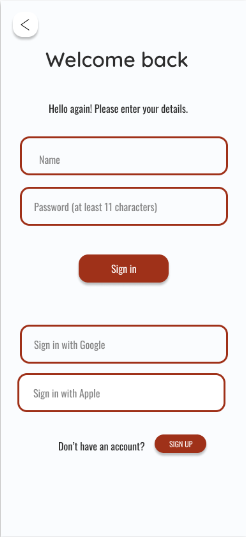
This was the second version of Meet Here, as stated earlier I think a better color pallete is in order. This is also the version that I tested with users. Feedback Included:
Add screen to easily access friends locations for reference and so not to have to type them in all the time.
Fix navigation button make more an obvious call to action.
Sign in with Google more of an obvious call to action.
Conclusions
At first I was slightly apprehensive about the usefulness of this app, but after reading the data, it seems most people like the idea. Giving users as much control over their location information I think will really contribute to the success of the app.
I did think more about what could make this app better, and I thought adding the ability to text addresses in app would be pretty helpful. In the next version I will include a better coordinated color palette. This process also solidified some concepts that I hadn’t quite grasped yet, because of this I think my abilities for my next project will definitely reflect that.
I would also want to think of a way that people could feel secure in sharing locations/addresses.


