Greenway
Summary
The goals of the project include making sure that users of a bus app can see when their bus arrives at their designated stop and how much time it’ll take for them to get to said bus stop. The app should have a clear indication of the time stated on the bus tracker and an ETA for arrival to the bus stop.
Roles and responsibilities
Platforms: Mobile App
My responsibilities included user research, concept ideation, designing user flows, visual design, prototyping, user testing, and incorporating user feedback into design iterations.
Problem
As part of Thinkful’s curriculum I was tasked with creating a bus app that fulfilled 3 requirements.
Ensure that any rider can tell when each of the buses arrives at the Washington & State bus stop.
Ensure that all riders can tell how much time they have to get to the Washington & State bus stop *before* the bus they need arrives at that stop.
Allow riders to select one of seven bus lines to see a list of its future arrival times at the Washington & State bus stop.
I wanted to create a bus app that not only had great ease of use but that was also purposeful. I designed Greenway as a “green” transit system. More specifically, Greenway would also be able to show users how they were minimizing their carbon footprint.
So, in order to set myself apart I was able to design an appealing, minimalistic, and simple app. One that would be more user friendly while also bringing awareness to the user.
Audience
Persona’s and the target audience were aimed at commuters or more specifically students, caretakers, eco-conscious people.
Research
To be able to acquire the information needed, I created an online survey. I was able to gather insight from people who often used the bus as a mode of transportation.
Research Findings
Users indicated here whether they used another form of transportation other than the bus.
Users indicating their occupations.
Users indicating why they use the bus.
Q. What is a feature that you like about the bus app you currently use?
Easy to use
Provides real time bus status
Notifies if there are delays.
Q. What is a feature that you do not like about the bus app you currently use?
Bad layout
Bad ETA estimation
Completely unavailable when offline
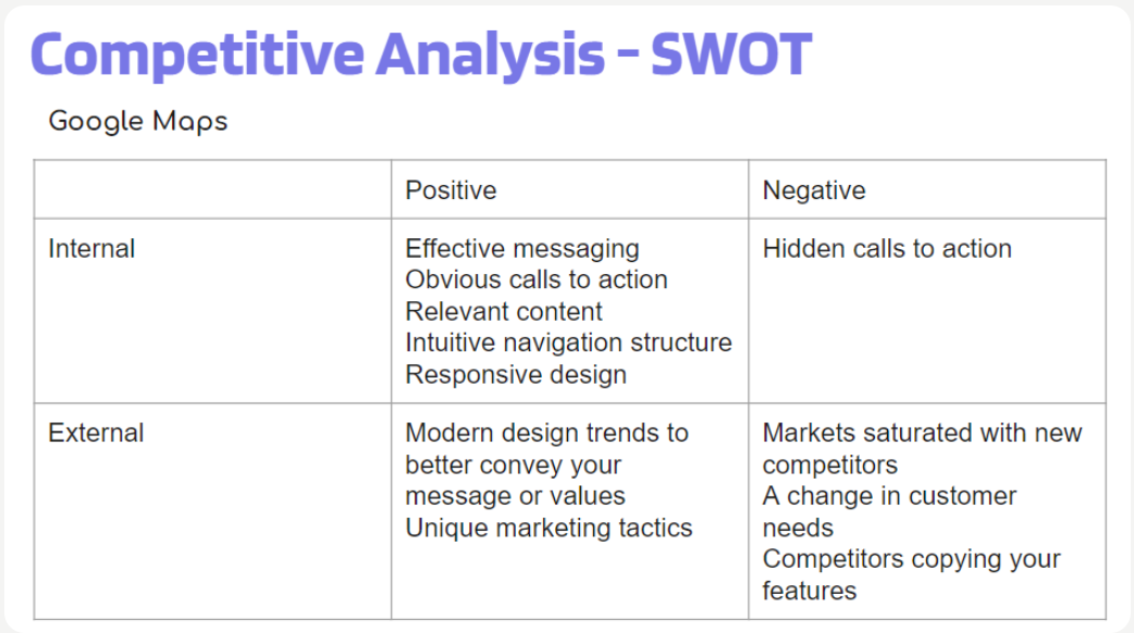
Competitive Analysis
User Personas
User Flows
I created three user flows based on common tasks that the target user/fan would do on the site.
Flow 1 - When bus is arriving at the Washington & State bus stop
Flow 2 - Next bus arriving at Washington & State bus stop
Flow 3 - Ability to view future arrival times for any of the seven bus lines, serving Washington & state.
Sketches
Digital Wireframes
Brand Development
Logo
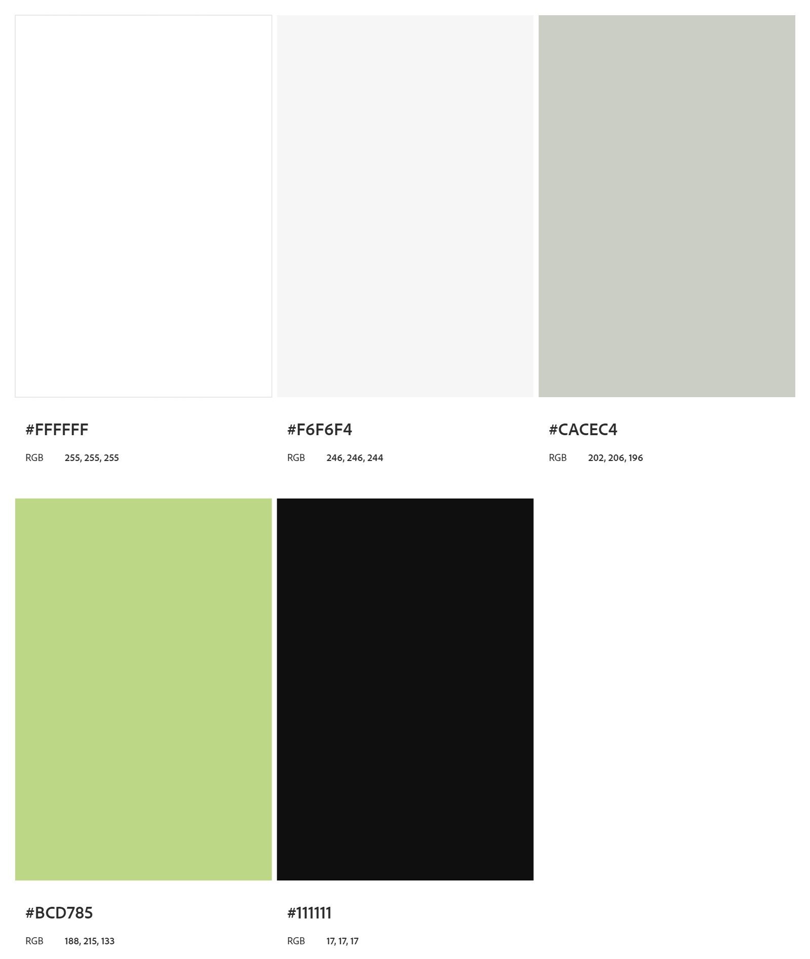
Color Palette
Typeface
Choosing the typeface for my first project was overwhelming, I felt there was a lot I didn’t understand yet, I did some research and learned that Roboto and Inter are two fonts that pair relatively well together. I chose these for Greenway so that they would not distract from the work, while also being standard enough to continue the design process.
I especially loved this color palette. I looked forward to using a type of green that could both depict “environmental green” and also a modern type of appearance for the user.
Here the logo depicts a bus in a sleek simple design. I started with the first design in Canva and ended up with this result. I think the straight forward image of a bus would accurately depict the type of app it is.
Solution
These are the ways that I tested Greenways usability
Users were asked to find when bus 20 arrived as Washington & state bus stop.
Users were asked to find the number of the next bus that was arriving at Washington & State bus stop.
Users were asked to find the routes page, and select the Washington and Sate route. From there they were asked to find the ETA of bus 20.
The age range of users who tested Greenway were from age 18-30
The majority of participants understood the general premise of Greenway.
1 of the 3 test participants had difficulty finding the Washington and State bus route.
Example: The color scheme and rounded buttons were consistently complimented.
Usability Testing
I found the user participants by word of mouth and through friends who I knew took the bus consistently.
Channels Used:
Personal Network
Screening Criteria:
Rides the bus somewhat consistently
Is familiar with how buses work
Prototyping
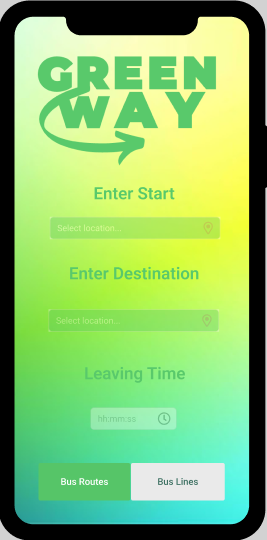
This was the first version of Greenway. Once I was able to understand more about the intricacies of design, I realized that this version was a bit of an eyesore. The gradient background in bright colors makes it immediately inaccessible. I also learned that the logo was large in excess. As I created this version I was using a UI kit, but did not yet understand how to best utilize it.
This was the second attempt at Greenway. My focus on this version was to make it in a dark interface. In a future version I want Greenway to be able to have the settings to switch from dark to lite, when I am presented with this option I am always delighted to use dark mode. When I reflect on these frames, I knew I definitely wanted change the way the map is presented. I also wanted Greenway to look a little more sleek and modern. In terms of what needed to change I decided to focus on a lite version first and then be able to establish a dark version. I also wanted to try a more minimalistic version.
Conclusion
I learned so much due to downloading several transportation apps. A takeaway would be that displaying information in an effective was garters more thought and strategy than I initially thought. I also thought about how else a transit system could further serve its users. Especially the audience that already utilizes public transport on a consistent basis. In my original idea for this app I though ta bout including a carbon emission tracker while using the bus. Users would be able to see first hand how much of an impact they were having on the environment by riding with Greenway while using the app. I found that adding this detail to the bus app project does a good job of setting this version apart.


